Since this is being cut from vinyl, would you want the design to be somewhat simplified for cutting purposes?Originally Posted by Tracy


Since this is being cut from vinyl, would you want the design to be somewhat simplified for cutting purposes?


Tracy you haves a messageLet me know.
The Chipmunk
'04 F150 XLT
D.T.B.B.S Crew Member #1
The design has to be a single color. Like Black and White(the area of a picture that would normally be weeded out after the plotter cuts).
The Chipmunk
'04 F150 XLT
D.T.B.B.S Crew Member #1

no one has pics of Leisa?


There are plenty of pics of Leisa around, but none of them will do the sticker any good. There is a specific design that these "In Loving Memory" stickers usually go by and you just can't use pictures with them.
Something to the effect of this......

NIKON Squad member | Nikon D200 | Sigma 24-70 f/2.8 | Sigma 70-200 f/2.8
i wanted to integrate her face into the illustration.
had a kind of idea.. but i'll try one of the above also..
It's a good idea, but when you are using only a one color vinyl with the ability to only be cut in 2D putting her face in just wouldn't work.
Last thing you want happening is something like this.......

NIKON Squad member | Nikon D200 | Sigma 24-70 f/2.8 | Sigma 70-200 f/2.8

thats just scary! if they didnt do the teeth and crown it wouldnt have turned out that bad!
I did some work today on getting a flower but i wasnt liking the lok of it, it looked too flat..I'm still working on it tho!

As simple as possible. No need to get crazy.
A flower (as in ONE flower, not the whole mess) in this style is what I am thinking.

minus the color so it may have to be a little more interesting.
These should all give you an example of what the design needs to be similar to for it to work on the plotter and be easy enough to weed.
I like this, but maybe make the swirls a little less delicate:

damnit Tracy... u were not tu use that last image :d
i was about to post this...
i just need some input on the font and if we should do is flat or curved
note this is not finished, id like to get some input!!!1
i like the one that looks like a heart (above my last post) and so u know i have a shutter stock account. so i can download those files.
Did you use live trace?
I think something curved and the font pretty but on the thicker side so it's easier to weed. No really fancy shi.t.
Not this exactly, but you get the point.
Y'all know Uproot said he would make one too. I guess we can post them all u p and decide.
oh hell yea, well DL that shit and modify the curls to not overlap and to be a little thicker. Then put her name in the middle like this
http://www.coyote-custom.com/inmemorydecals/
Hey can we cuss again now? fuck?
YEAH WE CAN!
what about this?
ignore the sizing of the font..that can be fixed...
or....
I like the heart one the best. Good start but too dainty to weed. Everything needs to be thickened up somehow.

Thats awesome Travis
Brett (One of the true OG's, No really... ask anyone)
'15 Chevy SS
'16 K7 SXL SWP
www.facebook.com/brett.lowenthal1
R.I.P Leisa, You are never forgotten - 10/7/08
i'll see what i can whip up tonight if you guys still need designs.
dont take anything i say srsly. its the interwebs.
"too dainty to weed"?
the words, or heart? or both? thickening the words is going to be easy but the heart will be a little harder. let me know if there is any particular FONT u like. I have a few that are thicker and will post them up in a few.
I guess it will be fine. Ren's weeding anyways. So we can leave it up to her.
I'll browse some fonts.
aight, I'm going to go to the meet tonight to get my tail lights. I'll work on it more tonight and finish it by tomorrow! I plan on going to the mountains this weekend to get some fun driving in. BRETT U should come with us too!
I really dont want to offer it but I MAY be able to weed too....but thats more of a last ditch effort
Brett do u like the heart design?, I'm going to work on simplifying it a little to make it easier to weed.
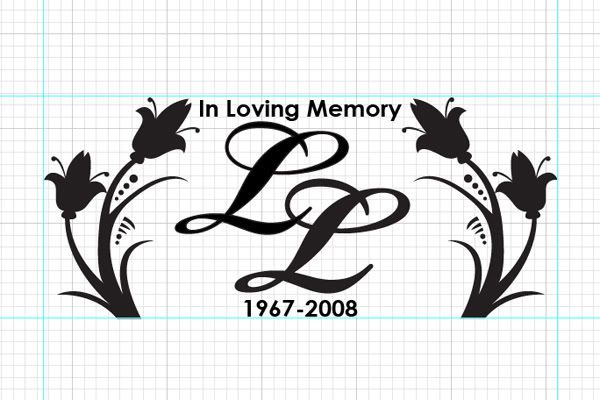
heres one... dont mind the blue lines / grid, they help me work :P
i figured two L's would suffice and represent her full name, cause people rocking the sticker would know the symbolism and legacy behind it.
the dots around the flowers can be weeded out no problem.

oo i like that
Val For President
R.I.P. Our Dear Leisa..
ASAP N.E. Chapter VP
No more supra
__________________________________________________ ________________________________________
NIKON Squad member| NikonD40
*waits for uproots design to blow mine outta the water*
thats pretty nice man!
I just think it should say Leisa not just an L though ya know?>
Brett (One of the true OG's, No really... ask anyone)
'15 Chevy SS
'16 K7 SXL SWP
www.facebook.com/brett.lowenthal1
R.I.P Leisa, You are never forgotten - 10/7/08
okk *back to the drawing board*
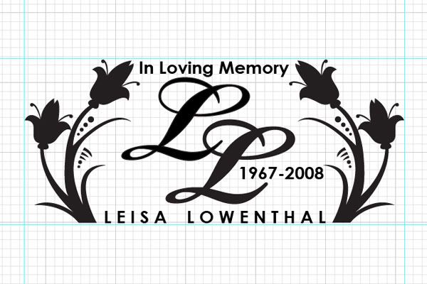
a little busy, but i think it works... what you guys think?

I do not know about you but I kinda like this one....but it is up to Brett...
yeah I do to, she used to have a purse with a L on it just like that L to
Brett (One of the true OG's, No really... ask anyone)
'15 Chevy SS
'16 K7 SXL SWP
www.facebook.com/brett.lowenthal1
R.I.P Leisa, You are never forgotten - 10/7/08

heres a couple i came up with
^ second one is fiyaa!
thanks broskie - i like the 'LL' idea too

just a quick one i made up in photoshop... similar to the ones already posted... but i like to keep things simple. not sure if that font will be thick enough though... easily changed.
I don't know any of you really... but I have unfortunatly made a few of these tribute stickers. I feel for all friends and family of Leisa.

 Posting Permissions


 Reply With Quote