


what's that? lol.Originally Posted by estis fatuus
on the pan, you should lower the watermark/sig a little bit into the white border, or change the font color as the black text gets lost in the darkness of the shot. love the pan! but i'm a sucker for them. you go to ga tech? looks like the shot is from that general vicinity.
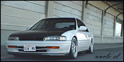
second shot's nice, just would have cropped the yellow curb out.

 Reply With Quote


