My brother is 13 and wanted a poster of himself for his room so I tried it. He also wanted a logo for him and his friends' "crew" (Loko) lol. Well this is what came out. Criticism welcome.
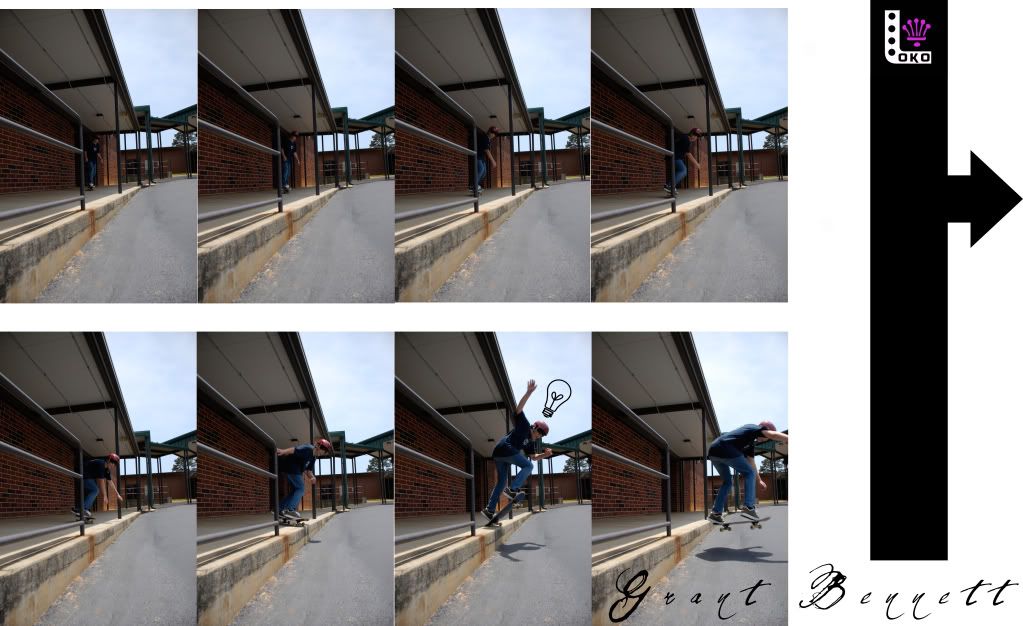


My brother is 13 and wanted a poster of himself for his room so I tried it. He also wanted a logo for him and his friends' "crew" (Loko) lol. Well this is what came out. Criticism welcome.

thats pretty cool, not really diggin the logo (i thought it said oko until i read the post) but the poster looks ok, like something from a skate magazine, simple and to the point...
i want to see more comps!!

Here goes ...
I am actually diggin the logo, "I like it." However the layout is not of my preference. The pictures are perfect for the type of poster you would be making. As far the layout I just thinks its too plain.
yeah i wanted a nice clean look, but it does need a little more i think. i'm not really very good at this yet lolol.Originally Posted by thecoolcutter
i thinks it's very good, minus one thing, that's the thin white stripe going horizontally at the top above the pictures. if the pictures could be at the very top of the whole poster, that seems like it would do better. other than that, looks awesome.

So, he got an idea when he ollied off the ledge?

i think its fine, its something you would see in thrasher or transworld. looks good to me man. i find it badass your bro is wearing a helmet too
Canon Nutswinger:
Canon XS
18-55mm
55-250mm
50mm USM

Kick flip or som ethin geez.
Jason..
lol. he can't really do much. BUT theses pics are kinda just placeholders. i'll throw in some better pics later. he can grind stuff here and there, so it'll probably be something like that.
ditch the white. looks pieced together in mspaint. i like the logo. i knew it said loko from the get go. put photoshop to good use. lose the tiny white gaps between the individual pics.
yeah this is def. the first draft. and, as i said before, the pics aren't the final ones so they're not perfect. the final will be much crispier. i just haven't taken the final pics yet. this is just for criticism on layout and the logo i guess lol. oh and for the white... it's just so that it would be easier to print. i'm thinking it needs a black border though.
but thanks for all the comments, guys. so far i'm hearing the logo is good, but the poster itself just needs cleaning up and maybe some more oomph lol.

cool good stuff
GECKOSquad

looks good. i dont like the light bulb but i am sure there is a reason for it.

damn i wish i couldve had u get pics of me when i used to skate i would like to see me doing a nollie heelflip off a loading dock like this
nice justin
 Posting Permissions


 Reply With Quote