


The crit came in the form of you're doing things that have been done before, and things that are pretty "cliche" in the art world. Especially on car art. Like I mentioned, I like to see how people react. Had you reacted the way you did right there (post #37), we could have saved all the bitching and moaning. And trust me.. I walk in your shoes allll the time. I wasn't joking when I said that I met with some of the design execs for Panoz and they asked me what the hell I was thinking (in a more polite manner) on some of my sketches that I was presenting to them. Each sketch that I had done were renderings that took about 12 - 20 hours a piece, and to me, they were brilliant. I had drawn them by hand, done color layer after color layer after color layer, then scanned them at 600dpi into photoshop, where I went through and made sure the color balance was perfect.. Literally, hours worth of work. I got so into the small details that I didn't notice little things that kill auto design. I unveiled one of them, and the first thing out of their mouths was "You have no side mirrors". I turned around and sure enough.. I had literally forgotten to put them on. They continued, and were kind of being smartasses, and were like "well.. would be very difficult to drive without sidemirrors" and all that. But, I held my tongue, and politely informed them that integrated into the front brake vents are cameras that act as side mirrors. BS explanation on the spot. 2 of the 5 were impressed and thought it was cool.. 3 of the 5 continued roasting me for it. It sucks to have your bubble busted, but it happens. Some people are nice about it, most aren't. It's part of being in the art world. Look for things that aren't commonly done as far as your art goes. Some of the most beautiful things in car design are in the details (see attached image). Sure I could have taken a picture of an NSX, but that's been done before. Trying to find an interesting angle, I was sitting on the ground next to the car and noticed that the "NSX" logo was stamped on the caliper, and the wheels happened to be turned so it framed it perfectly. So I snapped a photo of it. The picture itself was cool, but I wanted something a little more, so I decided to make it into a real piece of art instead of a photo. My thought process was "What do brakes and brake calipers do? They stop.. they give control.. they slow down..." I wanted to emphasize the feeling of being in control, which is why I did the big bold lines all around the NSX logo. I oversaturated the caliper, to make it pop. Once I was happy with the lines, I took a step back and thought some more. "How will I really make that NSX logo on the caliper pop out?" Well... red is pretty much a universal "STOP!" color.. red stop signs, red lights... so I colorized red all around it. I did it piece by piece, section by section. Was I sure I wanted to do all red like that? Should I only do a corner? I put a green filter over the NSX logo/caliper square.. red and green are complimentary colors.. the red background with the green filter made that center focal point pop like nobody's business. I stepped back and looked at it again. It looked plain still, but was there a beauty in that simplicity? I thought more about what brakes do. They stop you.. you halt.. stop as a command means decist.. quit... hmmmm... maybe I could throw some text on there and seal up my point. But first, let me lay a design grid over this.. so I printed out a rough copy and gridded it out.. where is there a logical, nice place for some text? Ah... right across the center... and now what text? I want something simple.. something modern, but not too modern. Not something that will detract from the focal point.. what if it looks like a typewriter did it? Let's try it out... looks good!
And that was just on a single piece. The execution of the piece took moments to do.. it's not a technically difficult piece. But the thought behind it took hours. And of course, as soon as I was done, I started naming off a thousand and one things I would change.. but I left it be.. and it's because of this piece that I won the 2006/2007 portfolio award. Out of a possible 100 points (500 point total score.. 5 pieces are submitted), I got a 97 out of 100. 3 judges from SCAD, 3 from outside sources (a museum, a graphic design firm, and someone who knows nothing about art).
People will rip apart art that you do. Opinions are like assholes.. everyone has them, but not everyone wants something to do with yours. Don't flip out if someone doesn't like your work or has something negative to say.. instead, listen to what they say, learn from it, and apply that knowledge to your next piece. And be prepared to defend your work. If someone looks at the accord, for example, and says "Well that looks dumb.. it's all white and I can't see the car", don't lose your shit. Instead, have a defense prepared... "I exagerrated the contrast because I wanted to emphasize the sleek body line of the car, as well as make the piece appear almost like a vector image. When the body line was the focal point of the car, the contrast was so high that the background was almost black, and it was drawing attention to the black negative space instead of the car itself. I experimented with a few different colors and effects before deciding on the white background. The stark white balances out the extremely deep, dark values that are found in the lower half, and so instead of looking dark and gloomy, the piece took on a fresh, modern, crisp feel. I also emphasized the grafitti in the background as a sort of medium value middle ground, so the piece took on a bit more depth. By brightening the background to an extreme, the body lines of the car are highlighted, and the piece takes on a logical value progression from a dark, intense focal point that moves to a grey, neutral middle ground, and the whole thing is lightened and set off by the extremely high value background." All of a sudden, the person who is saying "Well that looks dumb" has gained insight into your design process, and with a good enough defense, you have completely changed their opinion of the piece. It has gone from a piece that is "too white and I can't see anything" to a piece that has a logical progression and a sense of balance and weight.
Keep that in mind the next time someone says something about your work.
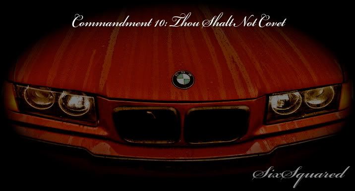
Oh yeah.. my brake caliper.. sorry it's small and you can't really see it.. the high res version is at home...

 Reply With Quote